A gamified wellness app for young adults in SUD recovery, designed to replace day-streak pressure using gamification.
The Problem
SUD prevalence among U.S. young adults (18–25) trended upward from 2011–2019, and this age group is more likely than any other to initiate or increase substance use. Fewer than 15% of young adults with SUD receive any treatment at all — barely above the roughly 10% rate a decade earlier.
Existing digital tools compound the gap: strict day-counting that erases all progress on one slip, clinical logging that feels like a chore, and interfaces with little emotional connection. Prairie starts from a different premise — recovery visualized as gradual, non-erasable growth, not day-counted discipline.
Research & Discovery
Four academic sources grounded the concept: addiction as a measurable deficit in brain-based decision-making, a systematic review finding gamification improves engagement but is rarely theoretically grounded, a meta-analysis showing smartphone interventions produce real reductions in depressive symptoms, and a study linking game design and multimodal feedback to increased motivation in rehabilitation.
A competitive analysis placed four existing apps — Headspace, Habitica, I Am Sober, and Finch — on axes of gamification, community, and emotional bonding, revealing a gap: nothing combined Finch's emotional warmth with a system structured enough to support genuine reflection.
Surveys with people in recovery and interviews with therapists, professors, and psychiatrists surfaced the same tension from both sides: daily reflection and visible progress helped, but privacy concerns and clinical-feeling tools got in the way. Three personas were built from that research — Kiki (21, cycling through relapse and shame), Popo (25, stable and wanting a celebratory tool), and Momu (20, not in recovery herself but supporting a friend who is) — extending the intended audience beyond people in active recovery to their support network.
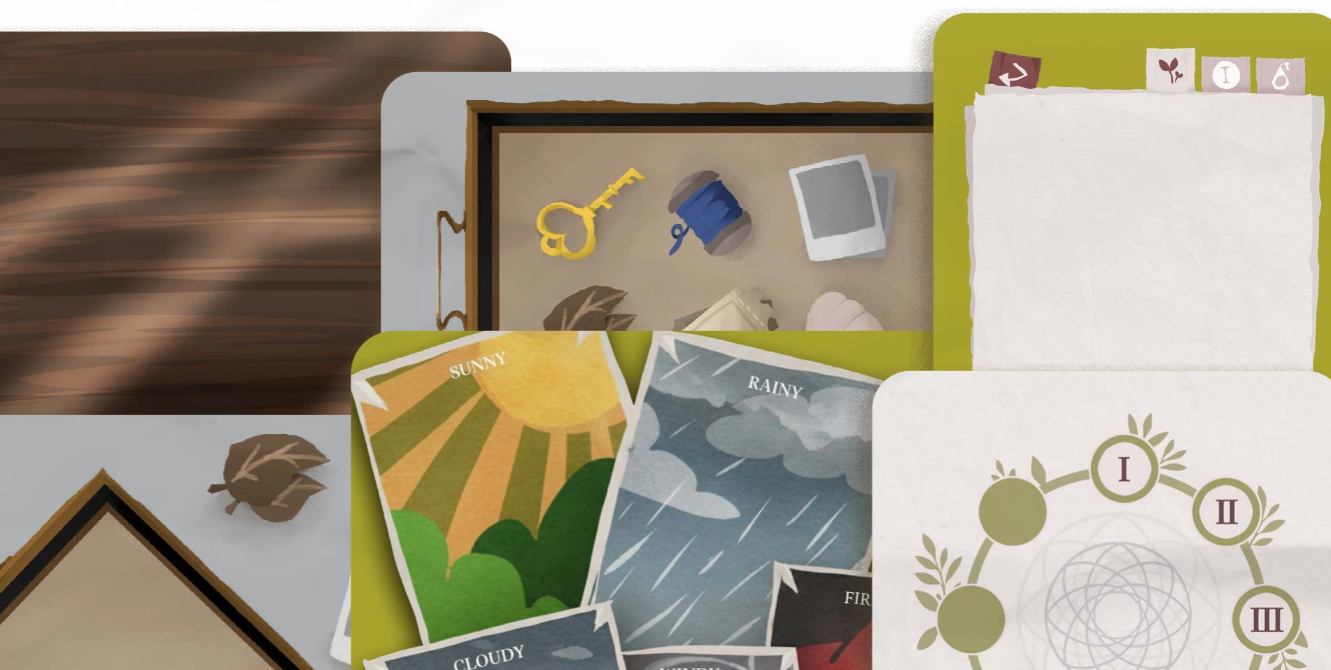
environment art — weather cards, memory pieces, journey map fragment
From Research to Decisions
“Counting days… worsened relapses, since one slip erased all progress”
Circular journey map replacing day-streak counters
“Strict data logging that feels clinical”
Weather-card mood check-in instead of a data-entry mood log
“Feeling stigmatized can reduce willingness to seek treatment”
Non-judgmental, gentle copy; opt-out always available without penalty
“Rewards and progress tracking kept motivation up”
Memory-piece collectibles and rewards/unlockables system
“Daily reflection and journaling helped personal growth”
Puzzle-based reflection as the core daily ritual
The Pivot
The project began under a different name. A mid-project deck called it “Leap”, tagline “Light Step at a Time” with its own full brand identity, a Nunito Sans type scale, and a bottom tab-bar navigation model. The final documentation renames the product “Prairie,” with a new logo, a six-color palette, and a top icon-tab bar. Both phases are shown here as real process, not one erasing the other.
One detail survived the rename almost untouched: Leap's olive tone (AEA530) is nearly identical to Prairie's final “Leafy” (ADA630) — the core brand color carrying through even as the rest of the palette, the typefaces, and the navigation model all changed.

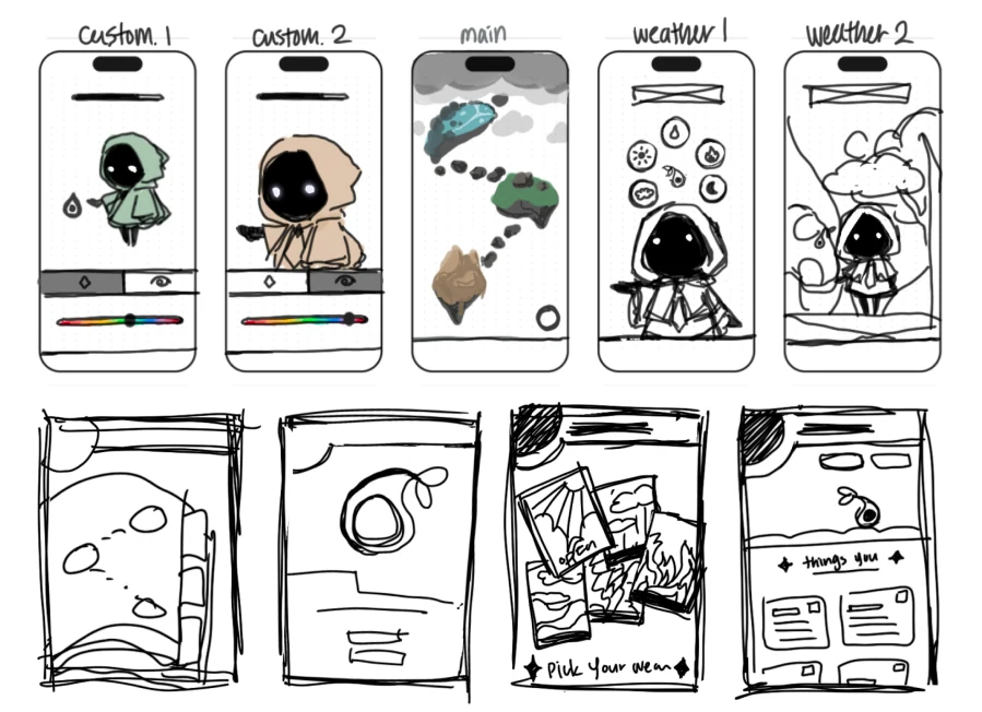
sketch — early wireframes (Custom.1/2, weather states) and thumbnail sketches
Branding & Identity
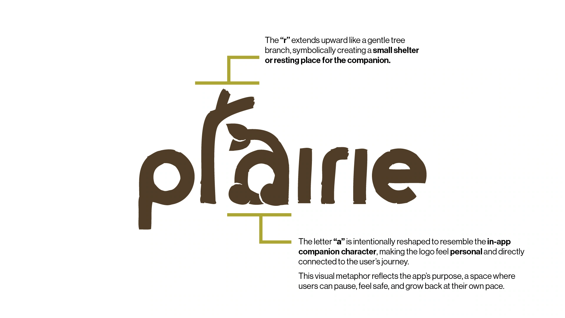
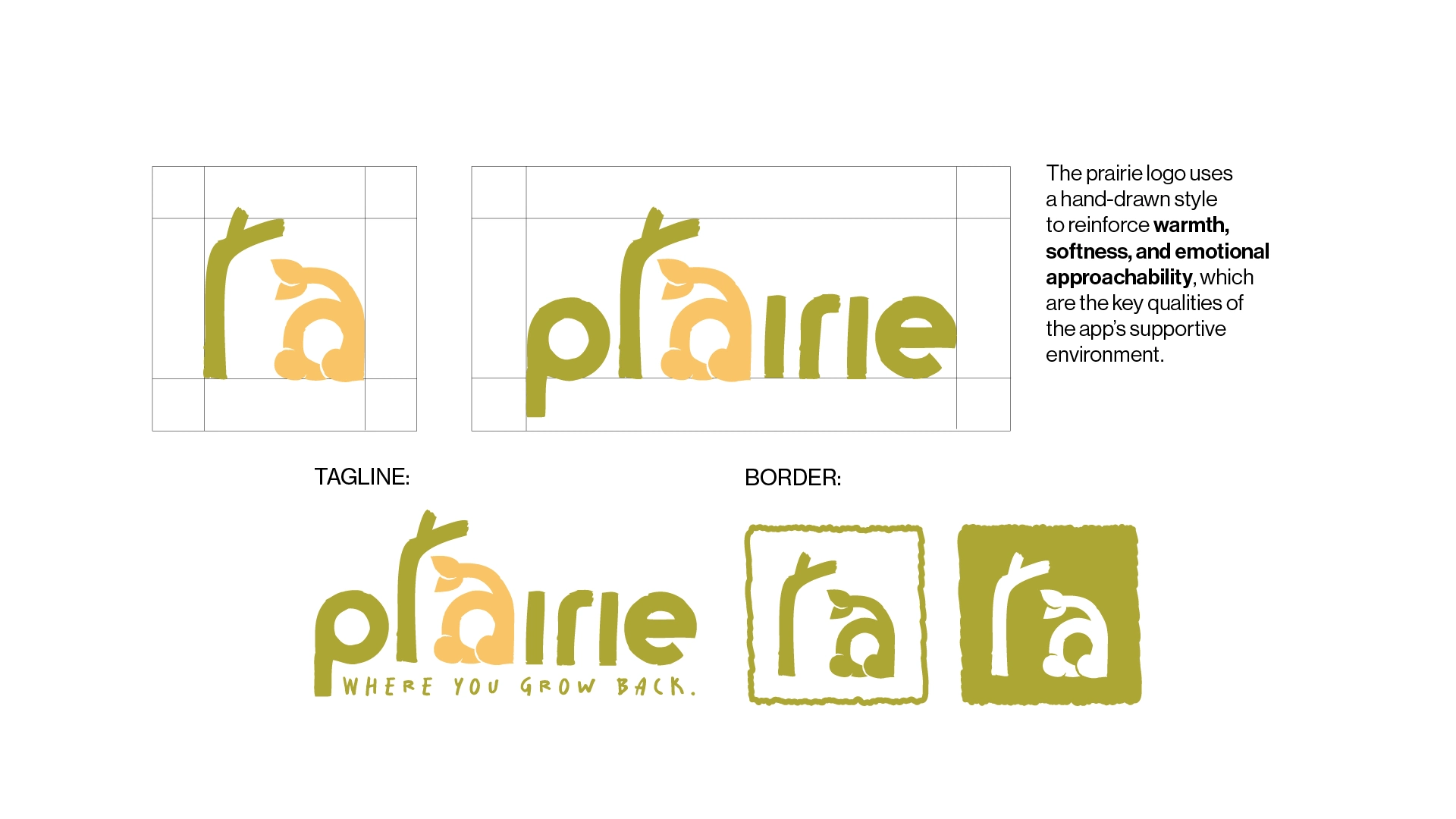
The wordmark is built entirely around the product's central metaphor. The ascender of the ‘r’ extends upward like a tree branch, forming a small shelter for the companion; the ‘a’ is reshaped to resemble the in-app companion character itself, making the logo feel personal and directly connected to the user's journey. A standalone ‘ra’ mark exists as an icon-only lockup for recurring use as a page-corner brand mark.
The palette carries six named colors, each mapped to a stage of the recovery journey: Leafy (olive/mustard), Pit (dark brown), Raspberry (dusty rose), Cotton Candy (mint), Custard (warm yellow), and Tomato (dark red) — combining grounded comfort with hopeful brightness. Typography pairs BD Plakatbau, a bold hand-drawn display sans, with Salted, a looser marker-style script.

logo-prairie — construction rationale

logo-prairie-tag — full lockup, tagline, border system
Character & Illustration
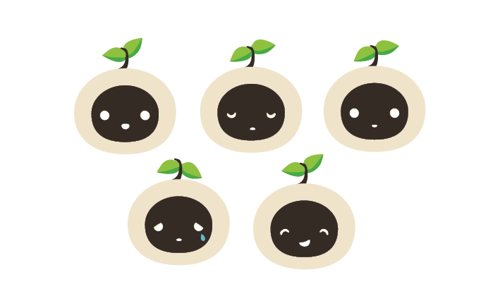
The companion is round and soft-bodied, cream/white, with large dark eyes and no visible mouth in most views. A plant stem and leaves grow from its head, culminating in a blooming flower at a later growth stage — sprout to flowering plant, visually tracking the user's consistency over time.
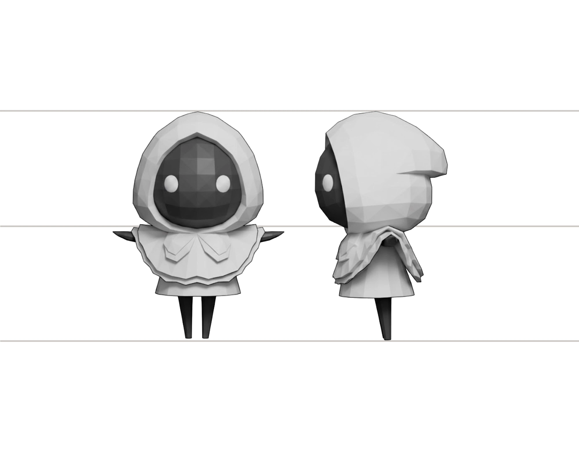
Named visual references spanned Journey, Monument Valley, and Sky: Children of the Light for tone and calmness, plus Animal Crossing and the game Peak for character and world style. The companion was eventually modeled in full 3D as a low-poly turnaround — evidence of the same mid-project shift toward game-engine fidelity that reshaped the rest of the product.

traveler — companion 3D turnaround, front and back
A Later Pass: Meet Sproot
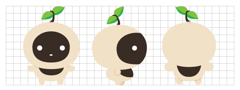
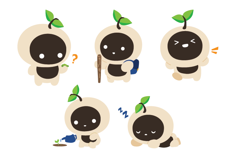
By the end of spring semester, the original companion still didn't feel fully resolved, so I went back into the character design with fresh eyes and designed Sproot — a plant-headed companion built around the same growth metaphor, refined into a cleaner, friendlier shape.

Sproot — 360° character construction sheet

Sproot — expression sheet

Sproot — pose & action sheet
The plant motif ties directly back into Prairie's core metaphor of growth through recovery — this pass exists to carry that idea through with more clarity and warmth.
Product Design — UX/UI & Game Design
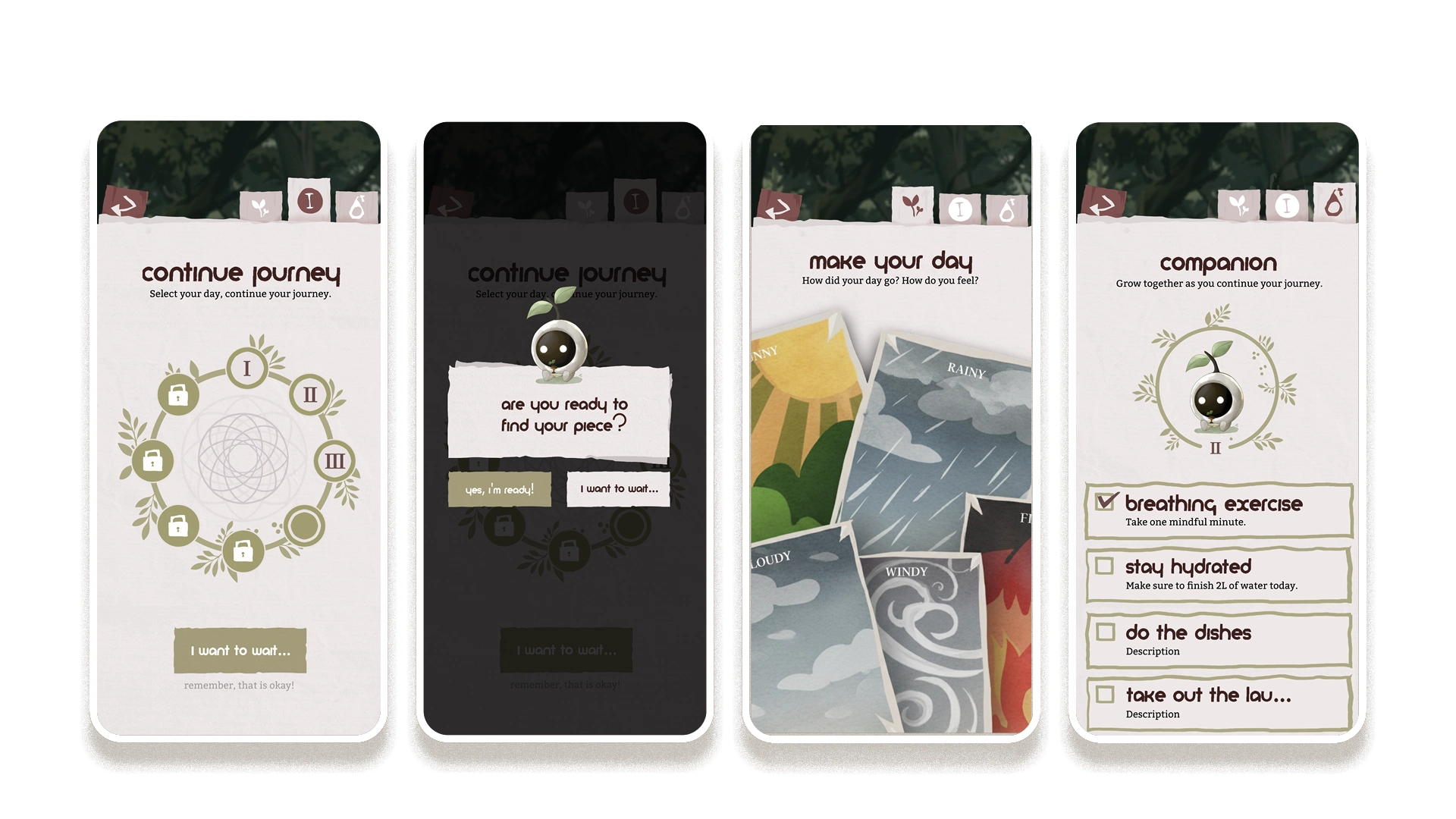
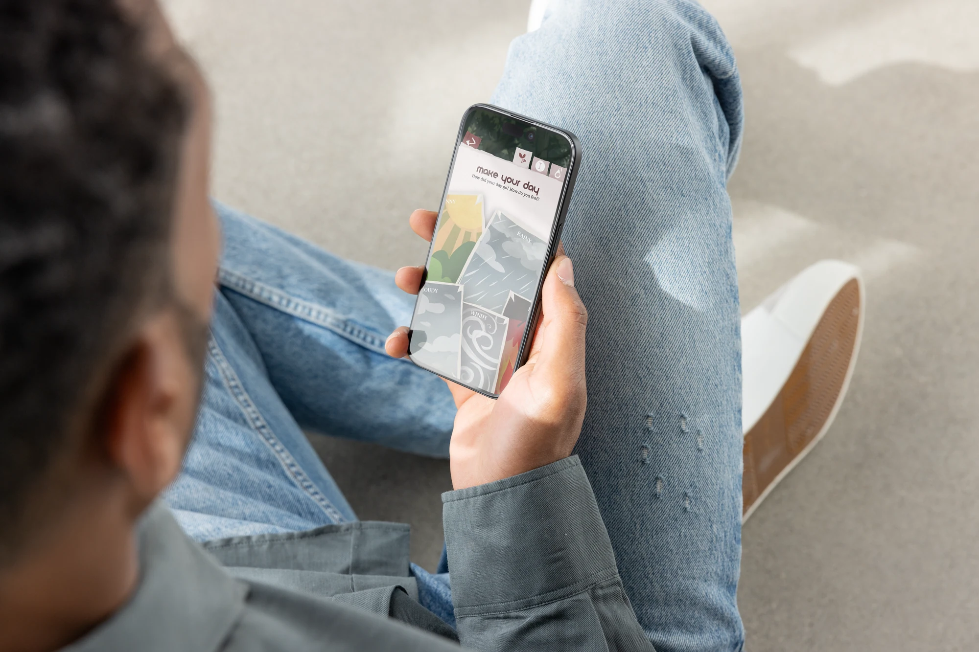
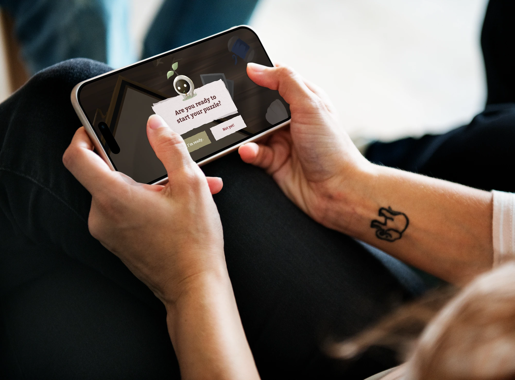
The recurring loop: the companion initiates contact with a low-pressure prompt (‘are you ready to find your piece?’, always answerable with ‘I want to wait…’ at no cost), the user logs a daily mood as weather, completes a short puzzle-based reflection that unlocks a memory piece, works through a small self-care checklist with the companion, and watches a circular journey map of numbered nodes fill in — built so a missed day or a setback never erases what came before.
The Core Loop

screens — Continue Journey, companion prompt, Make Your Day, companion checklist
Four design principles anchor every mechanic: Fun (‘recovery as something you can enjoy as you go through, rather than obligation’), Rewards (achievement and unlockable content that celebrates growth at any scale), Engagement (puzzles, challenges, and visible progression that keep users invested), and Immersion (storytelling and metaphor — rebuilding a character piece by piece to make inner healing feel personal).
In Context

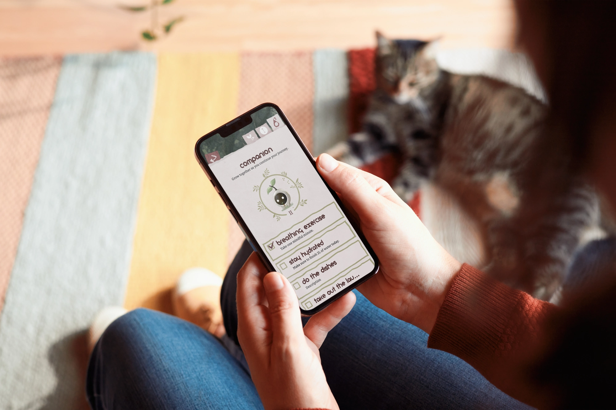
companionmu — companion checklist, in hand

main screen mock up — Continue Journey, in hand

makeurday — Make Your Day, in hand

phone mock up — puzzle reflection prompt, in hand
From Figma to Unity
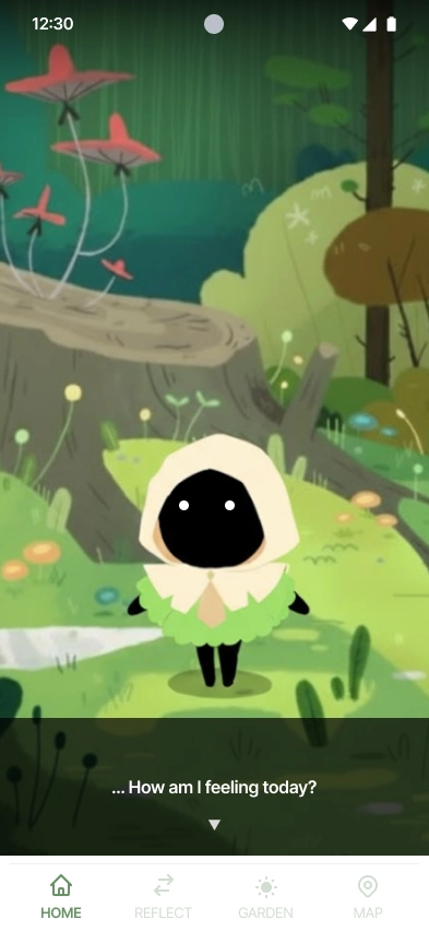
A mid-project tooling shift moved the build from Figma into Unity, since Figma couldn't fully visualize the game the way it was envisioned. The result is visible here: this screen renders the companion inside a fully painted environment with a bottom tab bar (Home / Reflect / Garden / Map) — more resolved, and more game-like, than the cream-card UI used everywhere else in the final documentation. It reads as the missing later iteration the process docs describe but never show.

Map progression — Unity-era environment screen
Reflection & What's Next
A year of research, branding, illustration, and interaction design left Prairie with a strong emotional core and a handful of open decisions I'd rather name honestly than paper over. Here's what I'd resolve first if the project continued.
Two competing navigation models — a bottom tab bar and a circular journey map — were both explored but never reconciled.
Resolve into a single primary navigation system before further UI work.
The core puzzle mechanic was named as a reflection ritual but never specified mechanically.
Prototype and playtest 2–3 puzzle formats to find the right level of challenge.
No dedicated flow exists for relapse or setback moments — a gap that matters most in a recovery product.
Design a compassionate re-entry flow so a break in the streak never reads as failure.
Accessibility and data-privacy handling were discussed in research but never formally documented.
Write formal accessibility and privacy guidelines before development handoff.
What this year taught me most was how to hold research, branding, illustration, and interaction design as one continuous act of care, and to keep asking whether each decision made the experience feel a little more human.